Opulence: The Design System of the Future
Design System
of the future
A scalable design system that reduced design time by 73%, sped up product revamps by 3.75×, and laid the foundation for AI-assisted design and development workflows.
Building a design system for one of India's largest private banks came with a unique set of challenges - ranging from deeply rooted legacy constraints to the complexities of aligning people, processes, and products at scale.
Opulence:
The Design System
of the future
A scalable design system that reduced design time by 73%, sped up product revamps by 3.75×, and laid the foundation for AI-assisted design and development workflows.
Building a design system for one of India's largest private banks came with a unique set of challenges - ranging from deeply rooted legacy constraints to the complexities of aligning people, processes, and products at scale.
Overview
Role
Role
Role
Design Systems Expert (McKinsey & Company)
Design Systems Expert (McKinsey & Company)
Design Systems Expert (McKinsey & Company)
Project type
Project type
Project type
Design System - Building and Governance
Design System - Building and Governance
Design System - Building and Governance
Client
Client
Client
A Private Sector Bank in India

When I joined the team, one of India's largest private sector banks was undergoing a significant digital transformation, but its design ecosystem remained highly fragmented.
There was no centralized design system to ensure consistency across products. Colors, typography, spacing, and UI patterns were implemented inconsistently, components were recreated from scratch for different projects, and there was no shared design language bridging design and engineering. This lack of standardization made collaboration difficult, slowed product delivery, and resulted in an inconsistent user experience across the bank's digital products.
The Challenge
A CEO decision and the roadmap expanded almost overnight. What began as a proof of concept with 15 foundational components quickly evolved into a mandate to build a scalable, AI-ready design system within just 2 to 3 months.
With only two designers leading the effort, it was clear that designing features individually would not scale. We needed a foundation that could accelerate delivery without compromising consistency.
A CEO decision and the roadmap expanded almost overnight. What began as a proof of concept with 15 foundational components quickly evolved into a mandate to build a scalable, AI-ready design system within just 2 to 3 months.
With only two designers leading the effort, it was clear that designing features individually would not scale. We needed a foundation that could accelerate delivery without compromising consistency.

A big question to us was - How might we….
build a scalable design system that enables rapid product development today while remaining flexible enough to support future growth and AI-assisted workflows?
A big question to us was - How might we….
build a scalable design system that enables rapid product development today while remaining flexible enough to support future growth and AI-assisted workflows?
Background Research
After evaluating the constraints, we realized that a successful product revamp would only be possible with a strong design foundation in place.
We shifted our focus to building a scalable design system first, enabling faster delivery, greater consistency, and a foundation that could support the product well beyond the initial launch.


EVALUATION OF THE FRAMEWORK
Instead of adopting a generic framework, I developed a process tailored to the complexity of a large-scale banking product. It began with a comprehensive audit to identify inconsistencies, establish design priorities, and focus on high-impact components that directly influenced financial data presentation, readability, and accuracy.
INTEGRATING INDUSTRY STANDARDS
In parallel, we validated the new visual direction while identifying edge cases early in the process. We established a robust design token architecture based on OKLCH color values and WCAG 2.2 accessibility standards, complemented by daily design-engineering syncs, Storybook integration, and Zeroheight documentation to ensure a scalable and efficient Phase 1 rollout.
INTERACT WITH THE PILLS TO LEARN MORE
OKLCH tokens
OKLCH tokens
Motion and Haptics
Motion and Haptics
Adaptive Shadows
Adaptive Shadows
WCAG 2.2
WCAG 2.2
Process
Phase 1 - Strategy alignment, scope and success metrics

A Strong System Starts with Strong Foundation
Before designing components, I established the foundational layer of the system. By standardizing color, typography, spacing, iconography, elevation, radius, and design tokens, I created a single source of truth that ensured consistency, improved scalability, and simplified collaboration between design and engineering.
01
COLORS
02
TYPOGRAPHY
03
ICONS
04
CORNER RADIUS
05
SPACING
06
SHADOW
07
TOKENS
08
HAPTICS
09
MOTION
10
SOUND
To build a system that could scale, we had to start from the ground up. Without a structured foundation, every new feature and redesign introduced inconsistency, duplication, and unnecessary rework.
01 COLORS
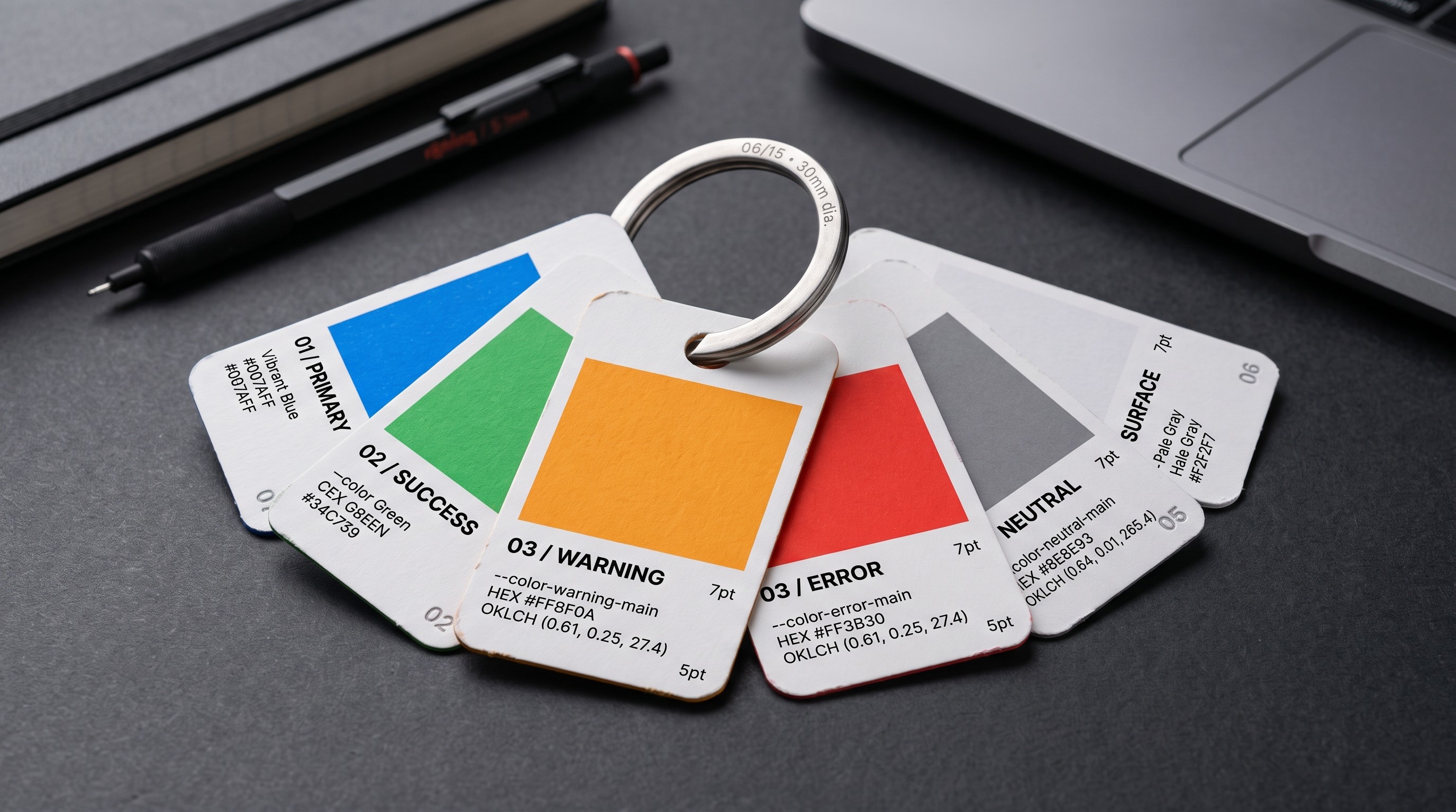
I restructured the color palette into a scalable, semantic token system aligned with the brand. Leveraging OKLCH for perceptually uniform color generation and WCAG 2.1 for accessibility compliance, the system supports light and dark themes while ensuring consistency across design and development.
02 TYPOGRAPHY
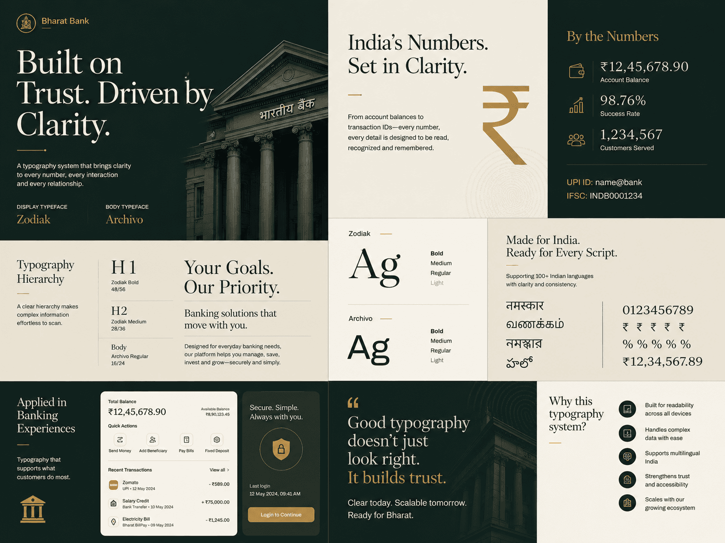
Financial products rely on fast, accurate information consumption. I standardized the typography system using Zodiak for expressive display content and Archivo for highly legible body text. By defining a clear hierarchy, consistent type scale, and usage guidelines, the interface became easier to scan, more readable, and consistent across web and mobile experiences.
03 ICONS
Banking interfaces demand a highly contextual iconography system, where every symbol must be instantly recognizable and unambiguous. We crafted a bespoke icon set that balanced simplicity, consistency, and clarity, ensuring each icon communicated its purpose with minimal visual noise.

04 RADIUS
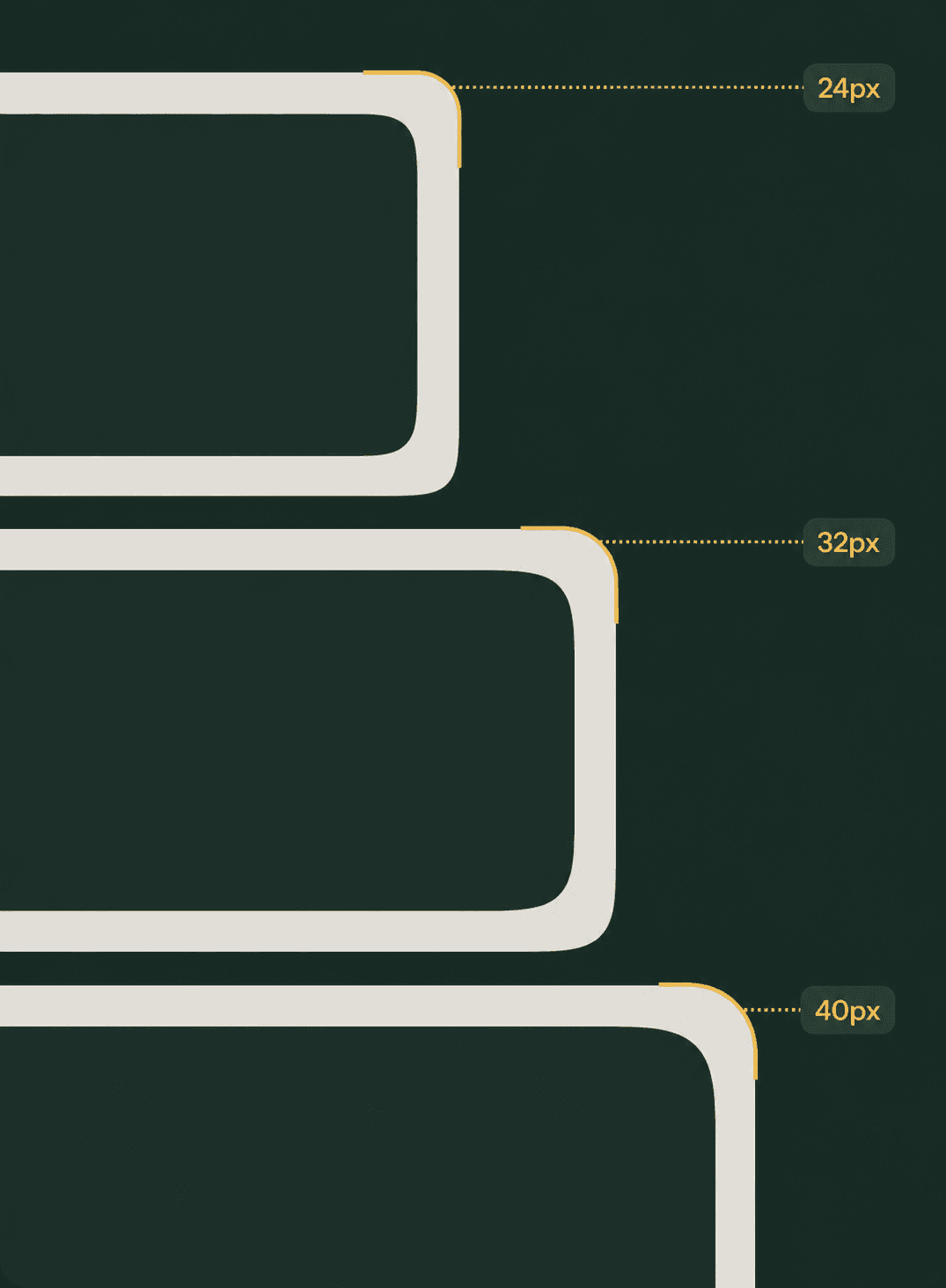
Financial products rely on fast, accurate information consumption. I standardized the typography system using Zodiak for expressive display content and Archivo for highly legible body text. By defining a clear hierarchy, consistent type scale, and usage guidelines, the interface became easier to scan, more readable, and consistent across web and mobile experiences.
05 SPACING
Spacing was treated as a foundational design token rather than an afterthought. By establishing a consistent spacing scale across components and layouts, we improved hierarchy, enhanced scanability, and created a cohesive experience across the entire product ecosystem.


06 SHADOW
Shadows became a functional layer of the design system, reinforcing hierarchy and spatial relationships throughout the interface. By defining reusable elevation levels, we created a subtle yet consistent sense of depth that improved focus, discoverability, and the overall polish of the product.
01 COLORS
I restructured the color palette into a scalable, semantic token system aligned with the brand. Leveraging OKLCH for perceptually uniform color generation and WCAG 2.1 for accessibility compliance, the system supports light and dark themes while ensuring consistency across design and development.
02 TYPOGRAPHY
Financial products rely on fast, accurate information consumption. I standardized the typography system using Zodiak for expressive display content and Archivo for highly legible body text. By defining a clear hierarchy, consistent type scale, and usage guidelines, the interface became easier to scan, more readable, and consistent across web and mobile experiences.
03 ICONS
Banking interfaces demand a highly contextual iconography system, where every symbol must be instantly recognizable and unambiguous. We crafted a bespoke icon set that balanced simplicity, consistency, and clarity, ensuring each icon communicated its purpose with minimal visual noise.
04 RADIUS
Financial products rely on fast, accurate information consumption. I standardized the typography system using Zodiak for expressive display content and Archivo for highly legible body text. By defining a clear hierarchy, consistent type scale, and usage guidelines, the interface became easier to scan, more readable, and consistent across web and mobile experiences.
05 SPACING
Spacing was treated as a foundational design token rather than an afterthought. By establishing a consistent spacing scale across components and layouts, we improved hierarchy, enhanced scanability, and created a cohesive experience across the entire product ecosystem.
06 SHADOW
Shadows became a functional layer of the design system, reinforcing hierarchy and spatial relationships throughout the interface. By defining reusable elevation levels, we created a subtle yet consistent sense of depth that improved focus, discoverability, and the overall polish of the product.
Tokens
Previously, design decisions relied on hardcoded values and individual judgment, making consistency difficult to maintain as the product grew. By introducing semantic design tokens, we established a flexible foundation that connected design intent with implementation. Every color, spacing value, typography style, and elevation level became reusable, context-aware, and scalable, ensuring consistency across products while supporting future theming, automation, and AI-assisted development.

Phase 1 - Strategy alignment, scope and success metrics
Phase 1 - Strategy alignment, scope and success metrics
Phase 1 - Strategy alignment, scope and success metrics
A Strong System Starts with Strong Foundation
Before designing components, I established the foundational layer of the system. By standardizing color, typography, spacing, iconography, elevation, radius, and design tokens, I created a single source of truth that ensured consistency, improved scalability, and simplified collaboration between design and engineering.
01
COLORS
02
TYPOGRAPHY
03
ICONS
04
CORNER RADIUS
05
SPACING
06
SHADOW
07
TOKENS
08
HAPTICS
09
MOTION
10
SOUND
01
COLORS
02
TYPOGRAPHY
03
ICONS
04
CORNER RADIUS
05
SPACING
06
SHADOW
07
TOKENS
08
HAPTICS
09
MOTION
10
SOUND
To build a system that could scale, we had to start from the ground up. Without a structured foundation, every new feature and redesign introduced inconsistency, duplication, and unnecessary rework.
01 COLORS
I restructured the color palette into a scalable, semantic token system aligned with the brand. Leveraging OKLCH for perceptually uniform color generation and WCAG 2.1 for accessibility compliance, the system supports light and dark themes while ensuring consistency across design and development.
02 TYPOGRAPHY
Financial products rely on fast, accurate information consumption. I standardized the typography system using Zodiak for expressive display content and Archivo for highly legible body text. By defining a clear hierarchy, consistent type scale, and usage guidelines, the interface became easier to scan, more readable, and consistent across web and mobile experiences.
03 ICONS
Banking interfaces demand a highly contextual iconography system, where every symbol must be instantly recognizable and unambiguous. We crafted a bespoke icon set that balanced simplicity, consistency, and clarity, ensuring each icon communicated its purpose with minimal visual noise.
04 RADIUS
Financial products rely on fast, accurate information consumption. I standardized the typography system using Zodiak for expressive display content and Archivo for highly legible body text. By defining a clear hierarchy, consistent type scale, and usage guidelines, the interface became easier to scan, more readable, and consistent across web and mobile experiences.
05 SPACING
Spacing was treated as a foundational design token rather than an afterthought. By establishing a consistent spacing scale across components and layouts, we improved hierarchy, enhanced scanability, and created a cohesive experience across the entire product ecosystem.
06 SHADOW
Shadows became a functional layer of the design system, reinforcing hierarchy and spatial relationships throughout the interface. By defining reusable elevation levels, we created a subtle yet consistent sense of depth that improved focus, discoverability, and the overall polish of the product.
07 TOKENS
Shadows became a functional layer of the design system, reinforcing hierarchy and spatial relationships throughout the interface. By defining reusable elevation levels, we created a subtle yet consistent sense of depth that improved focus, discoverability, and the overall polish of the product.
01 COLORS
I restructured the color palette into a scalable, semantic token system aligned with the brand. Leveraging OKLCH for perceptually uniform color generation and WCAG 2.1 for accessibility compliance, the system supports light and dark themes while ensuring consistency across design and development.
02 TYPOGRAPHY
Financial products rely on fast, accurate information consumption. I standardized the typography system using Zodiak for expressive display content and Archivo for highly legible body text. By defining a clear hierarchy, consistent type scale, and usage guidelines, the interface became easier to scan, more readable, and consistent across web and mobile experiences.
03 ICONS
Banking interfaces demand a highly contextual iconography system, where every symbol must be instantly recognizable and unambiguous. We crafted a bespoke icon set that balanced simplicity, consistency, and clarity, ensuring each icon communicated its purpose with minimal visual noise.
04 RADIUS
Financial products rely on fast, accurate information consumption. I standardized the typography system using Zodiak for expressive display content and Archivo for highly legible body text. By defining a clear hierarchy, consistent type scale, and usage guidelines, the interface became easier to scan, more readable, and consistent across web and mobile experiences.
05 SPACING
Spacing was treated as a foundational design token rather than an afterthought. By establishing a consistent spacing scale across components and layouts, we improved hierarchy, enhanced scanability, and created a cohesive experience across the entire product ecosystem.
06 SHADOW
Shadows became a functional layer of the design system, reinforcing hierarchy and spatial relationships throughout the interface. By defining reusable elevation levels, we created a subtle yet consistent sense of depth that improved focus, discoverability, and the overall polish of the product.
07 TOKENS
Shadows became a functional layer of the design system, reinforcing hierarchy and spatial relationships throughout the interface. By defining reusable elevation levels, we created a subtle yet consistent sense of depth that improved focus, discoverability, and the overall polish of the product.
Tokens
Previously, design decisions relied on hardcoded values and individual judgment, making consistency difficult to maintain as the product grew. By introducing semantic design tokens, we established a flexible foundation that connected design intent with implementation. Every color, spacing value, typography style, and elevation level became reusable, context-aware, and scalable, ensuring consistency across products while supporting future theming, automation, and AI-assisted development.
Outcome
Three-tier token system
As the design system matured, managing consistency across an expanding product ecosystem became increasingly complex. Static values and a flat token structure could no longer support the flexibility required for multiple themes, reusable components, and future product growth.
Three-tier token system
As the design system matured, managing consistency across an expanding product ecosystem became increasingly complex. Static values and a flat token structure could no longer support the flexibility required for multiple themes, reusable components, and future product growth.

To address this, I introduced a three-tier token architecture that separated primitive values, semantic intent, and component-specific implementation. This approach simplified theming, enabled context-aware design decisions, reduced maintenance overhead, and established a scalable foundation for design, engineering, and future AI-assisted workflows.
To address this, I introduced a three-tier token architecture that separated primitive values, semantic intent, and component-specific implementation. This approach simplified theming, enabled context-aware design decisions, reduced maintenance overhead, and established a scalable foundation for design, engineering, and future AI-assisted workflows.
Components & patterns
Components & patterns
As the design system matured, managing consistency across an expanding product ecosystem became increasingly complex. Static values and a flat token structure could no longer support the flexibility required for multiple themes, reusable components, and future product growth.

We built a massive library over the 4 months, creating a shared foundation for every product experience. Standardizing common interactions eliminated duplicate design effort, accelerated feature development, and ensured a consistent experience across web and mobile. The modular architecture also established a strong foundation for AI-assisted design and development workflows.
We built a massive library over the 4 months, creating a shared foundation for every product experience. Standardizing common interactions eliminated duplicate design effort, accelerated feature development, and ensured a consistent experience across web and mobile. The modular architecture also established a strong foundation for AI-assisted design and development workflows.
Design <> Dev workflow
Design <> Dev workflow
A design system is only as valuable as its documentation. Without a shared source of truth, components quickly become inconsistent, outdated, and open to interpretation across teams.

To address this, we built a Design<>Dev Hub that documented every component, including its purpose, anatomy, variants, states, token mappings, accessibility considerations, and behavior across light and dark themes. It also served as a collaborative space for implementation notes, feedback, and ongoing discussions, ensuring the system evolved alongside the product.
To address this, we built a Design<>Dev Hub that documented every component, including its purpose, anatomy, variants, states, token mappings, accessibility considerations, and behavior across light and dark themes. It also served as a collaborative space for implementation notes, feedback, and ongoing discussions, ensuring the system evolved alongside the product.
My Reflection
This project taught me that design systems are as much about people as they are about pixels. Success came from aligning designers, developers, and stakeholders around a shared language, not simply delivering components. Investing in foundations, documentation, and collaboration early proved far more valuable than optimizing individual screens, and that mindset has influenced every system I've built since.
My Reflection
This project taught me that design systems are as much about people as they are about pixels. Success came from aligning designers, developers, and stakeholders around a shared language, not simply delivering components. Investing in foundations, documentation, and collaboration early proved far more valuable than optimizing individual screens, and that mindset has influenced every system I've built since.
45%
Faster Redesign completion
3.75x
Faster Design Execution
68%
Time reduction