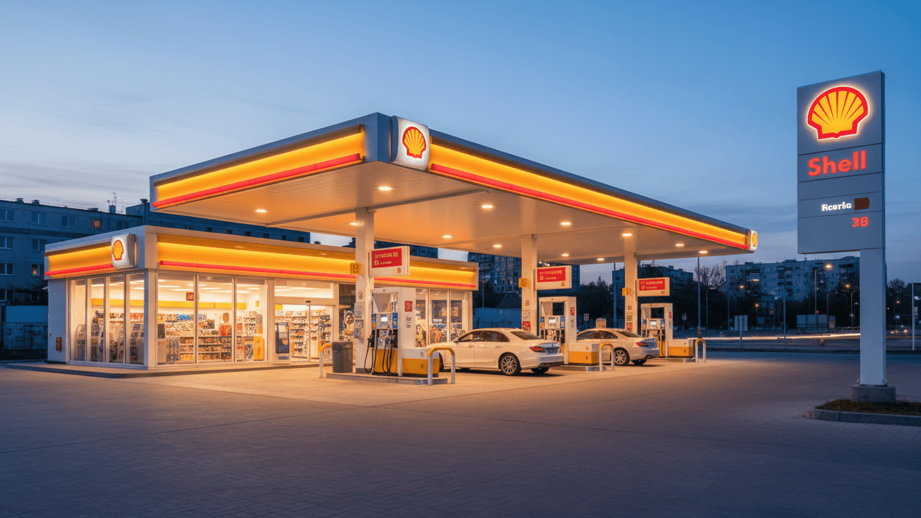
Shell GO+: Loyalty on Demand
The Shell GO+ app offers a unique approach to loyalty programs by rewarding customers with visits rather than points. This innovative concept has already been launched in multiple countries throughout Europe and Asia. The app's rewards system is designed to incentivize customers by offering a range of exclusive benefits, including discounts, instant rewards, and more.
Role
UX Consultant (Deloitte Digital)
Project type
UI/UX design, User research and Usability testing
Client
Royal Dutch Shell, plc
The Challenge
The brief was straightforward but ambitious: create a loyalty-on-demand platform that customers could use effortlessly at fuel stations. Users needed to track points, redeem rewards, and engage with Shell’s services without wading through unnecessary friction. The problem was clear - most existing loyalty apps in the market were cluttered, confusing, or lacked personalization.

What makes a $215Bn company tick? - It's Loyal Customers

Background Research
To ground our design, we started with a month-long research sprint. I visited Shell stations, interviewed customers, and analyzed competitors like BPme, Esso Rewards, and Nectar. A pattern emerged: while point accumulation was generally easy, redemption was often a headache. Many users abandoned loyalty apps because the rewards felt inaccessible or not worth the effort.
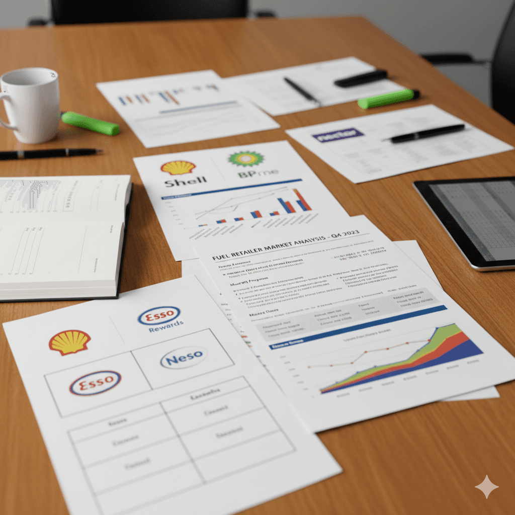
We analyzed major competitors such as BPme, Esso Rewards, and Nectar. Across the board, we found:
Points accumulation was straightforward but often rigid.
Redemption was cumbersome - requiring multiple steps or having limited reward options.
Community features were minimal, leaving engagement opportunities untapped.
This showed us a clear opportunity: prioritize simplicity and immediate value over gimmicks or complex mechanics.
Key Success Metrics Identified
Together with Shell stakeholders, we defined four success measures:
Enrollment rate
How many customers would sign up at stations.
Activation rate
%age of users completing their first profile action.
Repeat Usage/Churn
How often users returned in the first 30–90 days.
Satisfaction (NPS)
The qualitative feedback and ratings post-launch

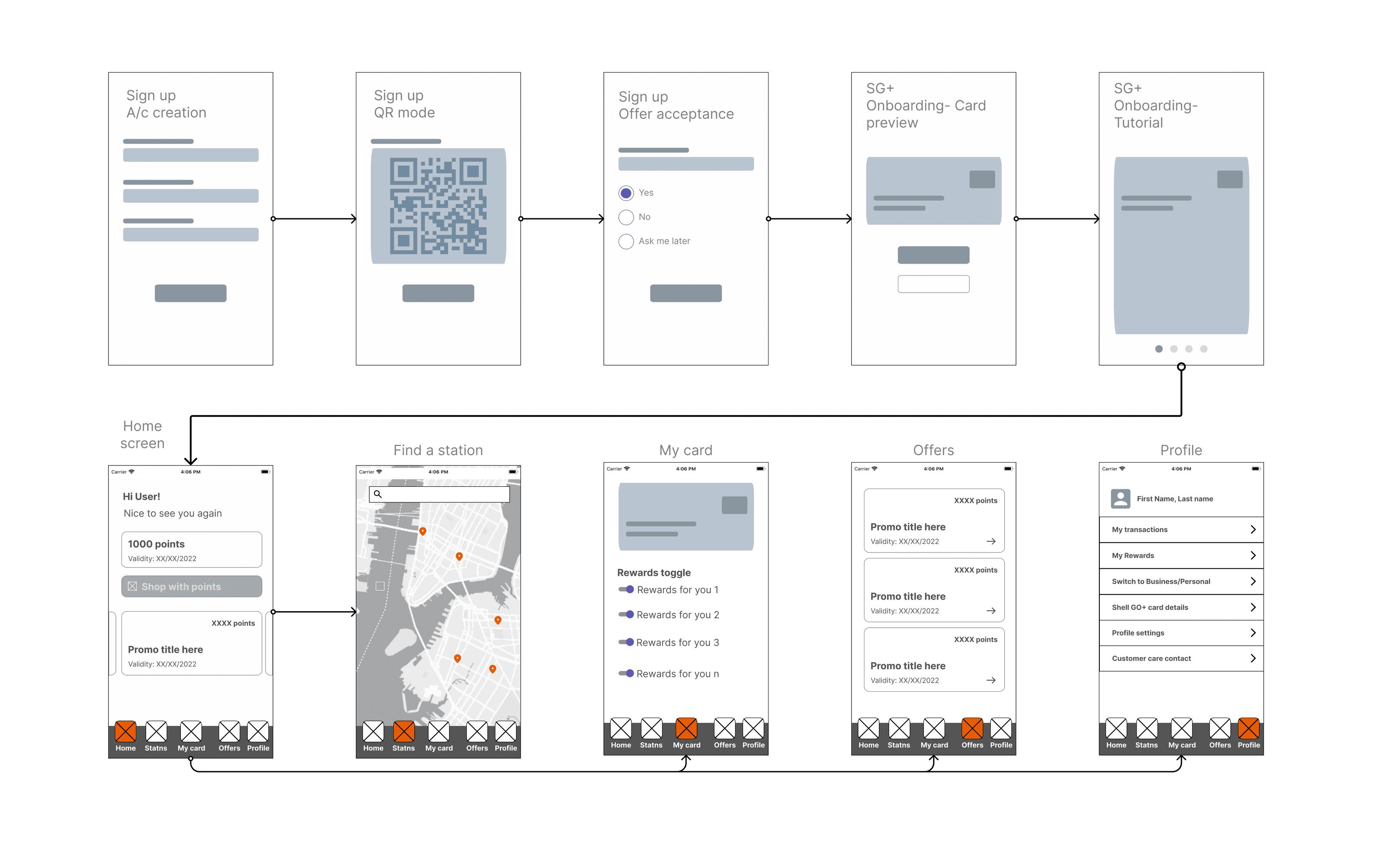
Design & test
Using Design Thinking, we worked in iterative cycles of 6 stages:
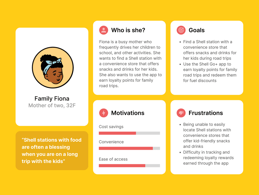
Developed personas and mapped end-to-end journeys.
Prototyped a mobile-first experience to replace physical cards.
Tested early flows with real users to refine pain points.
Personas focus teams on specific users, avoiding the “design for everyone” trap and guiding feature decisions through a clear evaluation lens.


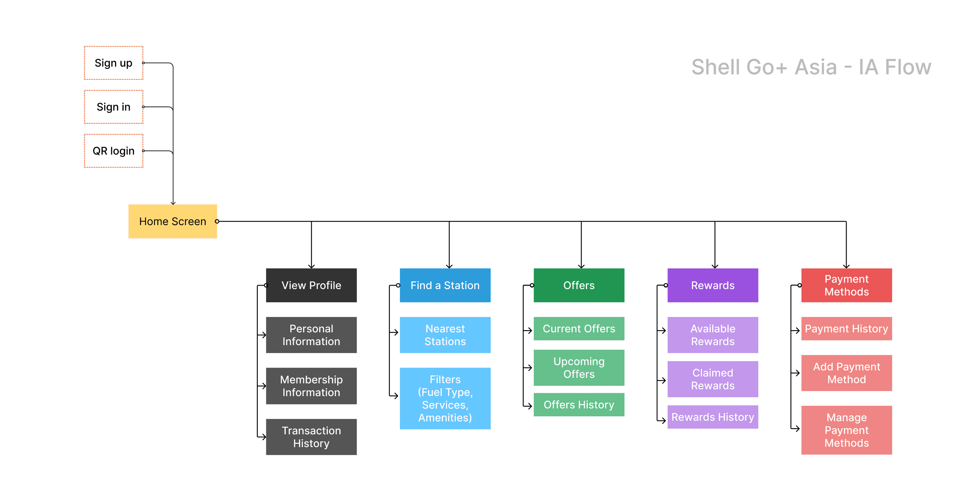
IAs brings consistency in the app's structure and labeling can make it easier for users to understand how the app works and find what they need.
By iterating on wireframes first, teams make faster, cheaper decisions and align on what matters: how the product actually works.
Outcome
16
of 20 users enrolled digitally in-store right after launch
Tap to flip
Enrollment rate
How many customers would sign up at stations.
Tap to flip
2X
activation driven by smart onboarding and promotional incentives
Tap to flip
Enrollment rate
How many customers would sign up at stations.
Tap to flip
Low
churn observed, with repeat use in the first week.
Tap to flip
Enrollment rate
How many customers would sign up at stations.


